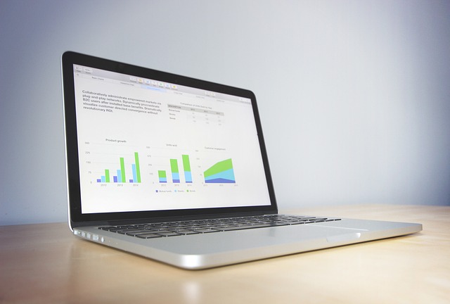
Understanding Graphs: Types of Graphs, A General Overview
Introduction
Graphs are essential data visualization to gain a clear understanding of information, respectively. As a student, business professional, or a researcher, it is highly important to understand these types of graphs and which to use for effectively concurring complex data. To that end, in this blog post, we’ll discuss various forms of graphs, usage, and how to pick the right one for your data.
Why Graphs Are Important
Graphs are of great importance when data is to be analyzed and presented. They allow us to:
Simplify Data: Complex datasets are hard to understand. Graphs condense information into a visual format that may be understood more readily.
Identify Trends: Graphs have a way of indicating trends and other patterns of the behavior of data through time, which makes them very effective for decision making.
Compare Data Easily: Graphs make it easy to compare different datasets visually, thus easily presenting conclusions.
Engage Audiences: Good graphs can draw viewers’ attention and spice up any presentation making data more interesting to audiences.
Common Graphs
3.1. Bar Graph
The most common graphical bars are used in the comparison of data belonging to different categories. They comprise rectangular bars whose length the bar actually measured against represents its corresponding category. Bar graphs can either be vertical or horizontal and have several instances of use especially for discrete data.
Use Cases: Bar graphs are often used in business reports, surveys, and research studies to compare between groups.
3.2. Line Graphs
Line graphs are excellent for showing trends over time. It consists of points connected by straight lines, showing how each data point changes in relation to the others. Line graphs are excellent for the visualization of continuous data, and they also find extensive use in financial analysis, sales tracking, and scientific research.
Use Cases: Use line graphs to represent the fluctuations of stock prices, temperatures going up and down, sales throughout the year, etc.
3.3. Pie Charts
Pie charts are ways of visualizing data as parts of a circular pie where a slice would be for each category’s proportion towards the whole. They’re excellent for depicting relative sizes and percentages so you can visualize the pieces in comparison to the whole.
Use Cases: Pie charts are widely used in marketing reports, demographic studies, and survey results to depict the shares of a market or population distribution.
3.4. Scatter Plots
Scatter plots are two-dimensional graphical representations showing individual data points, with coordinates using the Cartesian system. Scatter plots are particularly useful when identifying relationships between two variables. An observer can determine if a relationship exists by looking at the pattern formed by the distribution of the points.
Use Cases: Scatter plots widely in scientific research, economics, and social sciences apply in a situation where one needs to study the relationship between variables, for example, height and weight or income vs. levels of education.
3.5. Area Charts
An area chart is a line graph with an area under the line filled in, which draws attention to the volume of data over time. The charts are used for presenting the accumulated value of a few data series as well as to compare proportions.
Use Cases: Implement area charts to visualize changes in monetary reports: revenue growth over time, budget allotment over time, or perhaps website traffic.
Specialized Graphs
4.1. Histogram
A histogram is a specialized version of the bar graph, used to present the distribution of numeric data. As opposed to a standard bar graph, histograms sort the data into bins and draw the frequency of each range of values. That is the beauty of histograms-they are made just for displaying data distribution.
Use Cases: Histograms are extensively applied in statistics to find out distribution of test scores, age distribution, or any other type of data set that represents a continuous value.
4.2. Box Plots
The term box-and-whisker plot is also used for ‘box plots’, which summarize a dataset by describing its quartiles. Here it describes the median, range, and the possibility of outliers. Therefore, it can exhibit variability in data; they also provide direct comparison across different groups of distributions.
Use Cases: Box plots are extensively used in research to compare results from different experimental groups or datasets.
4.3. Radar Charts
Radar charts, or spider charts, is a two-dimensional chart used to plot multivariate data that utilize axes representing varied variables. The use cases range from comparing the strengths and weaknesses of multiple items.
Use Cases: Radar charts are commonly applied during performance evaluation, product comparison, and skills assessment.
Conclusion on Selecting the Right Graph
Right Kind of Graph Selection Depends On
Type of Data: The data you will present in a graph is either categorical, continuous, or ordinal. So decide what kind of data this is before choosing your graph.
Purpose: What You Want To Convey
Convey the need to compare things – shows trend, distribution, or relationship.
Audience: Choose a graph that fits the knowledge base of the audience.
Complexity: Simple, not complicated. For graphs that are too complex for those who read them will only confuse the matter instead of clarifying. There are different types of graphs: bar and line graphs, as well as more specific ones such as histograms and radar charts, each suited to a particular purpose in representation. This ability to choose the right graph for your data and audience enhances how you can communicate as well as the basis for clear visual representations of information on which to base decisions. It’s the difference between presenting findings to stakeholders versus researching or just sharing findings, and mastering the selection of graph can thus make your message well received.


